Thursday, 30 September 2010

Monday, 27 September 2010
Tuesday, 8 June 2010
last evaluation
1. What skills have you developed through this module and how effectively do you think you have applied them?
During this module I feel as though I have developed a series of different skills ranging from areas such as documentation on blogs all the way to 3D design. In essence I believe that I now have a better understanding of what it takes to make a well structured blog which delivers a clear story. My 3D work could have been a lot better but due to the workshop being so busy at this time of year I was not able to do a lot of things I wanted with the box which I wanted to.
I have started considering different media approaches and distribution such as 3D and digital. I did not apply my digital media as well as I would have liked as my ambitions were narrow to begin with as I did not want to give myself a major workload and over complicate my time and effort.
2. What approaches to/methods of research have you developed and how have they informed your design development process?
Research has been a stronger point for me during this module in particular due to the fact I am creating work for a statistic based audience, my questionnaires helped me out so much in defining whom my target audience is, what they wear, where they go, what they drink, when they sleep, where they shop etc.
I also think the structure of my research is the best structure yet. I used to just do all my context at the start of a brief then it was done with whereas with this brief I have juggled the two, relying on both to get me further on with my project. It has allowed me to be a lot more comfortable with my project with a clear direction of where I was going.
3. What strengths can you identify in your work and how have/will you capitalise on these?
My development skills, constant analysis and evaluations have been a great strength in this project, Without these my project could have drifted off into no where. Keeping on top of my documentation has allowed me to refer back to my work with a clear understanding of what needs to be done and when, so I am not using my time un-efficiently. My commitment to final products has been at an all time best and has allowed me to learn different ways of working using other facilities around the college.
4. What weaknesses can you identify in your work and how will you address these more fully?
My main weakness yet again is time management I believe that I need to book in the print room next time so I have a deadline for my work to be ready for, without any concerns with drop in being booked up or design boards not being printed out in a quality way. I think this is a vital area in which I am losing marks for in the project which is why I must be prepare my self for third year when all this and much more is expected of us.
I think I also need to produce more ideas at the start of a project as it seems although I am producing 20-40 ideas I should be doing so much more which would allow me to work out a fall back plan if anything was to go wrong with an existing concept in a crit or via statistics being incorrect/ just not working as a design.
5. Identify five things that you will do differently next time and what do you expect to gain from doing these?
1. Pay attention to workshops that are available and take more dedication in producing a 3D product rather than getting scared about time and rushing delicate areas such as the finish.
2. Be constant of my time, although I had a lot of time to do things, I didn't think about expanding what I could do. It was in my grasp to take this project and do so much more with it rather than a box, I could of made the digital distribution in after effects and made everything much more interactive.
3. Learn from my mistakes, think back to previous projects and notice what the problems were, in order to prevent me from making the same ones again on a new project.
4. Think about more ways to tackle one task, sometimes the easier idea could be much more interesting and look better and in all honesty ( be cheaper)
5. Book in at the digital dungeon at the start of the project so I am ready to print off boards and finals for crits.
6.How would you grade yourself on the following areas:
Punctuality: 5
Motivation: 4
Commitment: 4
Quantity of work produced: 3
Quality of work produced: 2
Contribution to the group: 3
3rd year
I collected a lot of examples of image and type in context. These were the images that really struck my attention, I loved the type on body image, I thought that kind of thing would add so much depth to my work if it turned out right. The majority of the images I love, but it is purely because of the context and experimentation of a lot of it e.g the fruit. I think the depth of some of the typography is amazing and very impressive, I would like to produce something with objects to produce a typeface.


I think that using type as image is a lot more effective and has a much more personal feel than if the type was on it's own. Being drawn onto a 3D model makes the type have different curves, a different kind of character and as a result a different element of interest. The only issue would be getting a model to let you draw on them with perm marker.


A little dirty but smart. Sexual health week, this campaign is based around the natural parts in life therefore the backing colour and type are based on skin colours and the type in a slightly sexist way is made out of penis's I believe that this would work in reality to the target age group as it is so bold and outrageous it would catch teenagers attention. I think it's funny but also on a serious tone, is very personal.


I love the idea of using type in context, in honesty I'm not quite sure what a FTLOT is but it doesn't bother me as I can see this is a nature piece so it has some enviromental values. The fact that you can take any object and make communication out of it is amazing. It is something I want to focus on and do more of.


This piece is an interesting one, I'm not sure of what it it represents bar part of the alphabet, but is the 't' supose to be duo tone?

Sandblasted glass is a cool way to use type as the enviroment in which it covers gains the textures of 3D elements behind. I think that this is a cool way of advertising as when you look at the type it is different from different angles.


This is the kind of stuff strive to achieve in 3rd year, I want to improve on my type generating skills and make calligraphy with such in depth texture like so. I think that an image like this has a thousand words, especially if the words used are ones of a strong meaning that makes the reader really think.


I might actually start drawing on fruit like this as I think it looks really cool when the type works in a spiral and the pt size and angles change according to which way the shape turns. The type doesn't have to be to amazing for it to look good.


Using scrap objects such as boxes is an interesting component to changing an identity of a product. I think that type looks really great when used in the correct way, but I really love it when it is type in context as it gives such a strong feel.


Temporary type is a great way too look at things, it is such a delicate process as one little slip and it's destroyed. I think type like this is so much more special as it doesn't physically last for ever so it is up to you to document it in such a way that it brings out the items best qualities so it can live forever.

3D/2D is an important factor in design, I think creating these 3D items and photographing them makes them so much more in depth than if the photo was taken and the type was just laid over the top.


Simple yet effective the piece is built up of lower case and higher case woodblock letters and doesn't strive to take the whole photo which makes it that bit more special, a simple message is displayed from this which is Typography in Austraillia.


This type is really cool I think the fact that it is pencil shaded gives it such a character that makes it really interesting, I tried to producing something similar with such a raised form, but it looked shockingly bad.


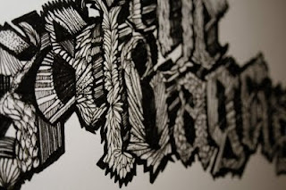


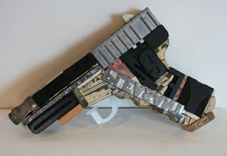


This above is amazing and is again something what I would like to develop in my 3rd year I believe that the detail and individuality of such a project makes it rewarding and looks really good.


This is one of these designs you see and well you just wish you had done it, using type like it was water creating a trail from a pipe.


Making images out of type, essentially filling in the missing paths


Using different shapes to make the image say what it is before you even read it.


Again 3D work that looks really good, wish I could get a lovely naked girl like this to draw on :)


Detailed type


Stock and emboss

Powerful calligraphy


Sunday, 6 June 2010
Deep.co.uk
This site is an interesting one as regards design, but is advertised in a very fine art way which as a Graphic Design company I think is an incorrect way of getting custom. All of the images on the portfolio have no real description of what we are looking at why we are looking at it and who it is for, which is a very open way of displaying projects. From the images the photos are very pro dealt with but the site remains more of a personal photography achievement site.

In his defense he has an extra ordinary client list with hundreds of clients with images of what he has produced for them, all the images appear again to be at a high standard although, his issue in my belief is that he needs a blog or somewhat of more description of his items so we know what we are looking at.

In his defense he has an extra ordinary client list with hundreds of clients with images of what he has produced for them, all the images appear again to be at a high standard although, his issue in my belief is that he needs a blog or somewhat of more description of his items so we know what we are looking at.
Friday, 4 June 2010
The Chase
Chase is a bold site which have a brief description about their selves, not everyone reads what is on a site unforutnatley however the story here is really interesting, the fact they turnover around £5.6 million is crazy!


But with a bit of further investigation I think that I have fell in love with the designs they do.
I didn't think much of the approach to the website but moving on and looking at the portfolio, it is one of the strongest and varied ones I have seen, I really love the statement 'we are painting the town red' then including the other colours, I think that it was a really smart way to incorporate and improve the famous statement.

I think it is also really good that they are not a one trick pony and have other skills to offer at really interesting and qualified approaches such as this design for digital, some of the shots are really out going and work really well.

Such a broad range of techniques are used in the portfolio, I think these illustrations are really cool and remind me a lot of the red bull advert kind of work.


This little piece below is another way of seeing that this company covers all kinds of elements of work including different tones of work, this place is so cool and again is another site that I would love to get an opinion on my work and keep into contact and perhaps one day meet up with them and have a talk about portfolio stuff


Tuesday, 1 June 2010
Placement 2
Below is a repky from a high school in Hindley in which I have asked about a placement:
Chris,
We will consider accepting students on placements if they are intending to do PGCE. I would have to consult with MsWoods before making any commitment.
Are you considering PGCE and how long would you want to come for if it was possible?
Martin Rigby
Hindley HS
I am currently waiting for feedback off them onto wether or not it would be possible for me to work there as I am looking into my masters degree and London, I need to of either worked in a educational enviroment or have had quite a few years experience in design as a freelance or in a graphics job so it seems benneficial for me to look into what it is like to teach the subject.
Chris,
We will consider accepting students on placements if they are intending to do PGCE. I would have to consult with MsWoods before making any commitment.
Are you considering PGCE and how long would you want to come for if it was possible?
Martin Rigby
Hindley HS
I am currently waiting for feedback off them onto wether or not it would be possible for me to work there as I am looking into my masters degree and London, I need to of either worked in a educational enviroment or have had quite a few years experience in design as a freelance or in a graphics job so it seems benneficial for me to look into what it is like to teach the subject.
Subscribe to:
Posts (Atom)