
I think that using type as image is a lot more effective and has a much more personal feel than if the type was on it's own. Being drawn onto a 3D model makes the type have different curves, a different kind of character and as a result a different element of interest. The only issue would be getting a model to let you draw on them with perm marker.


A little dirty but smart. Sexual health week, this campaign is based around the natural parts in life therefore the backing colour and type are based on skin colours and the type in a slightly sexist way is made out of penis's I believe that this would work in reality to the target age group as it is so bold and outrageous it would catch teenagers attention. I think it's funny but also on a serious tone, is very personal.


I love the idea of using type in context, in honesty I'm not quite sure what a FTLOT is but it doesn't bother me as I can see this is a nature piece so it has some enviromental values. The fact that you can take any object and make communication out of it is amazing. It is something I want to focus on and do more of.


This piece is an interesting one, I'm not sure of what it it represents bar part of the alphabet, but is the 't' supose to be duo tone?

Sandblasted glass is a cool way to use type as the enviroment in which it covers gains the textures of 3D elements behind. I think that this is a cool way of advertising as when you look at the type it is different from different angles.


This is the kind of stuff strive to achieve in 3rd year, I want to improve on my type generating skills and make calligraphy with such in depth texture like so. I think that an image like this has a thousand words, especially if the words used are ones of a strong meaning that makes the reader really think.


I might actually start drawing on fruit like this as I think it looks really cool when the type works in a spiral and the pt size and angles change according to which way the shape turns. The type doesn't have to be to amazing for it to look good.


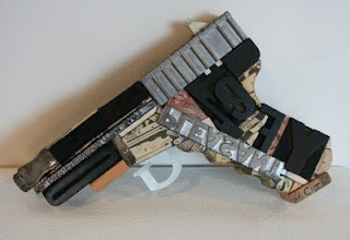
Using scrap objects such as boxes is an interesting component to changing an identity of a product. I think that type looks really great when used in the correct way, but I really love it when it is type in context as it gives such a strong feel.


Temporary type is a great way too look at things, it is such a delicate process as one little slip and it's destroyed. I think type like this is so much more special as it doesn't physically last for ever so it is up to you to document it in such a way that it brings out the items best qualities so it can live forever.

3D/2D is an important factor in design, I think creating these 3D items and photographing them makes them so much more in depth than if the photo was taken and the type was just laid over the top.


Simple yet effective the piece is built up of lower case and higher case woodblock letters and doesn't strive to take the whole photo which makes it that bit more special, a simple message is displayed from this which is Typography in Austraillia.


This type is really cool I think the fact that it is pencil shaded gives it such a character that makes it really interesting, I tried to producing something similar with such a raised form, but it looked shockingly bad.


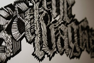


This above is amazing and is again something what I would like to develop in my 3rd year I believe that the detail and individuality of such a project makes it rewarding and looks really good.


This is one of these designs you see and well you just wish you had done it, using type like it was water creating a trail from a pipe.


Making images out of type, essentially filling in the missing paths


Using different shapes to make the image say what it is before you even read it.


Again 3D work that looks really good, wish I could get a lovely naked girl like this to draw on :)


Detailed type


Stock and emboss

Powerful calligraphy


No comments:
Post a Comment